Juul Labs
Accepting a job offer from Juul Labs sent me into an existential crisis. The term JUUL was synonymous with thousands of lawsuits in US and a steep rise in teenage nicotine addiction. But it was immediately clear upon joining that those were the actions of the old guard and this new team only had one mission: transition the world's cigarette smokers to vaping as a form of harm reduction. They also aimed to empower users by providing comprehensive vaping usage data, enabling them to make informed decisions about their nicotine consumption.
Behind a teetering company was an amazing, empathetic team of talent. Design, Engineering, and Management were all completely in sync. I worked remotely with my esteemed colleague Michelle Schirlin whom I had previously collaborated with at ngmoco. The company fostered a culture of active participation, with employees eagerly engaging in usability testing, and engineers displaying enthusiasm for tackling complex UI animations and motifs.
Web App 2.0
Hardware bluetooth connectivity within a browser still feels like magic that shouldn't be possible and yet here we are.
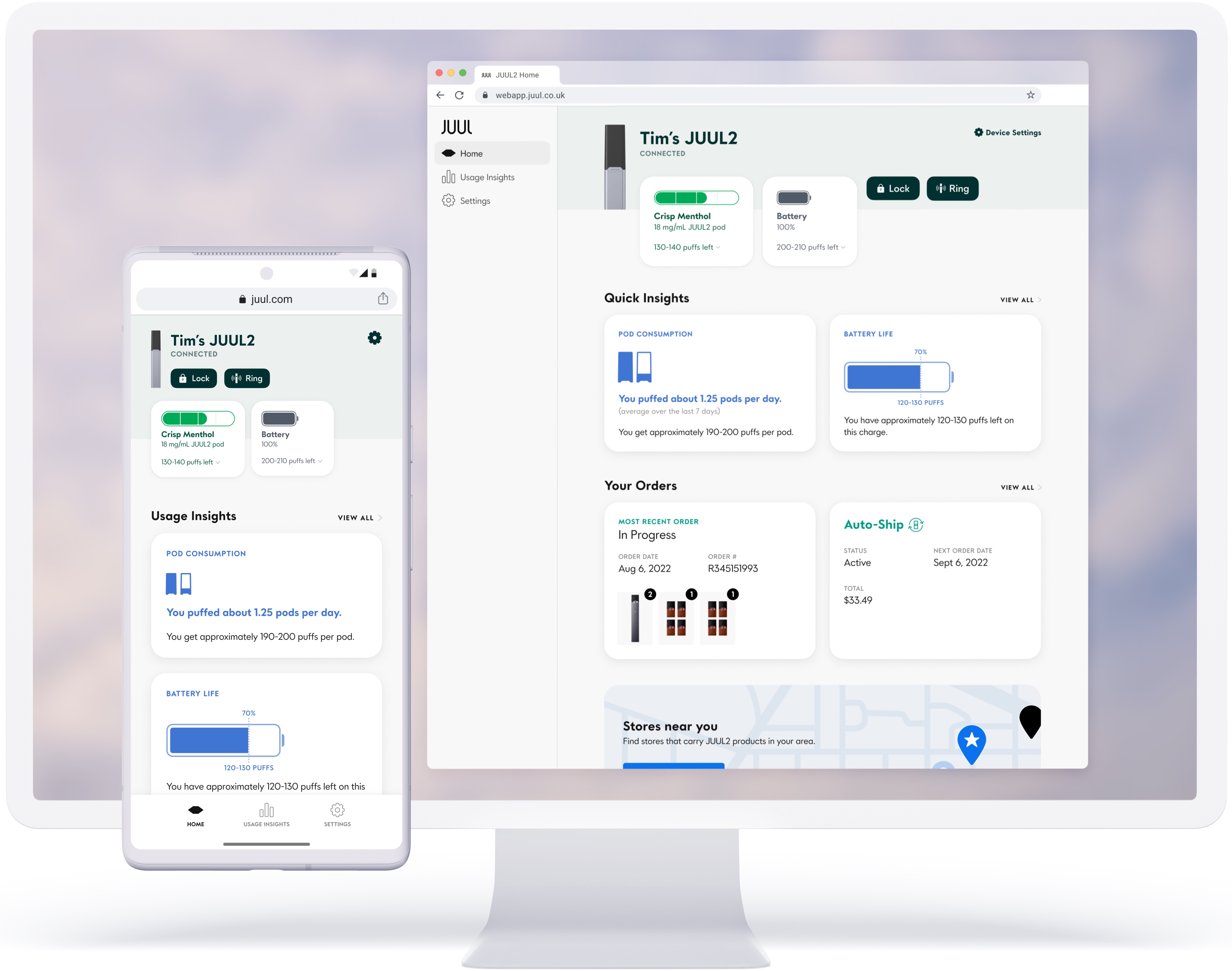
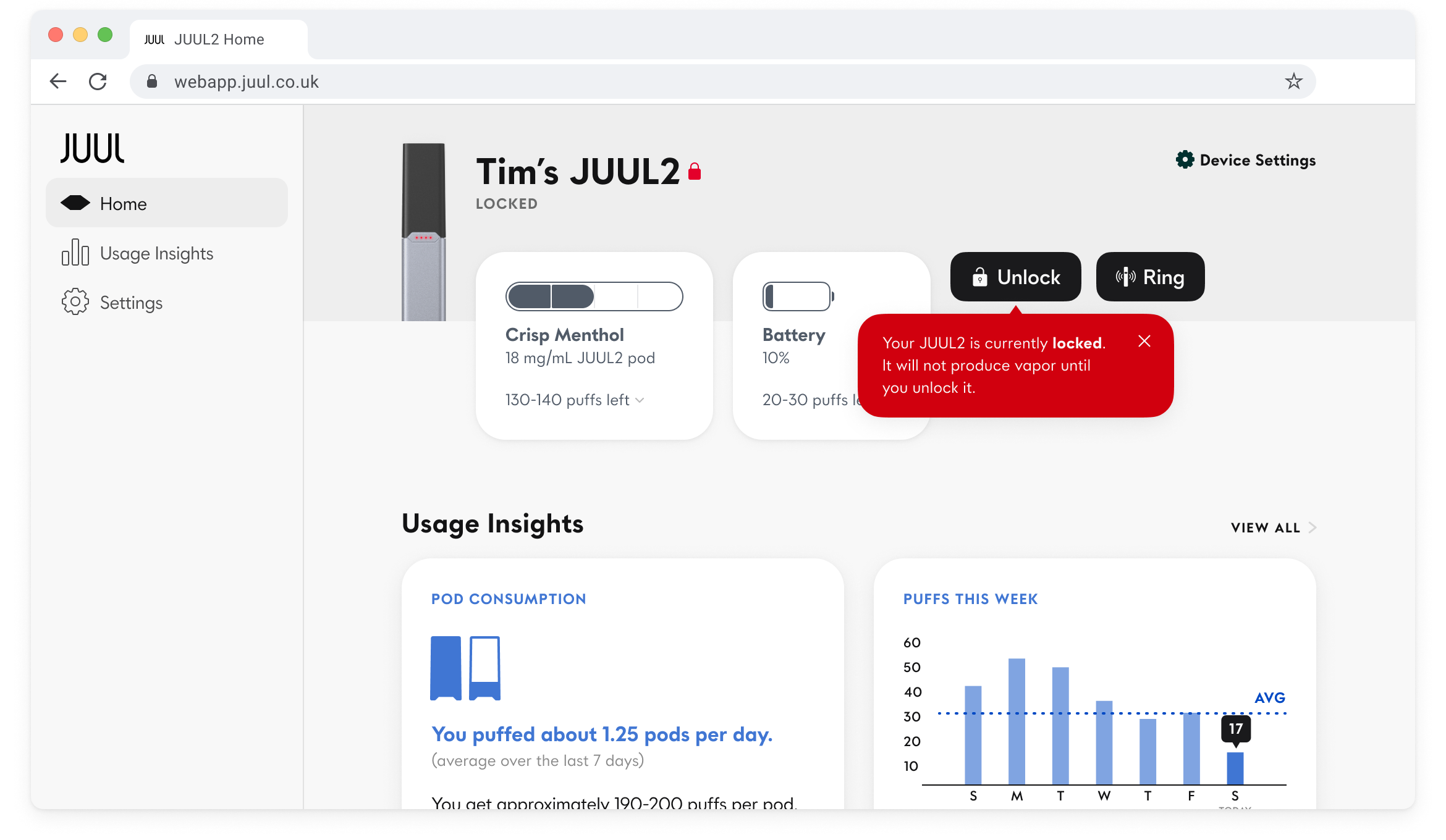
We wanted the JUUL2 connected device experience to be universal amongst all platforms so a responsive web app was the best way forward. You could lock your device from unauthorized users, have it play a sound if you've misplaced it nearby, see how much e-liquid and battery you had left and what those levels translated to in terms of number of puffs left, as well as get quick insights on your usage patterns. If you order your JUUL2 pods online we could also pull your most recent order data and subscription settings.
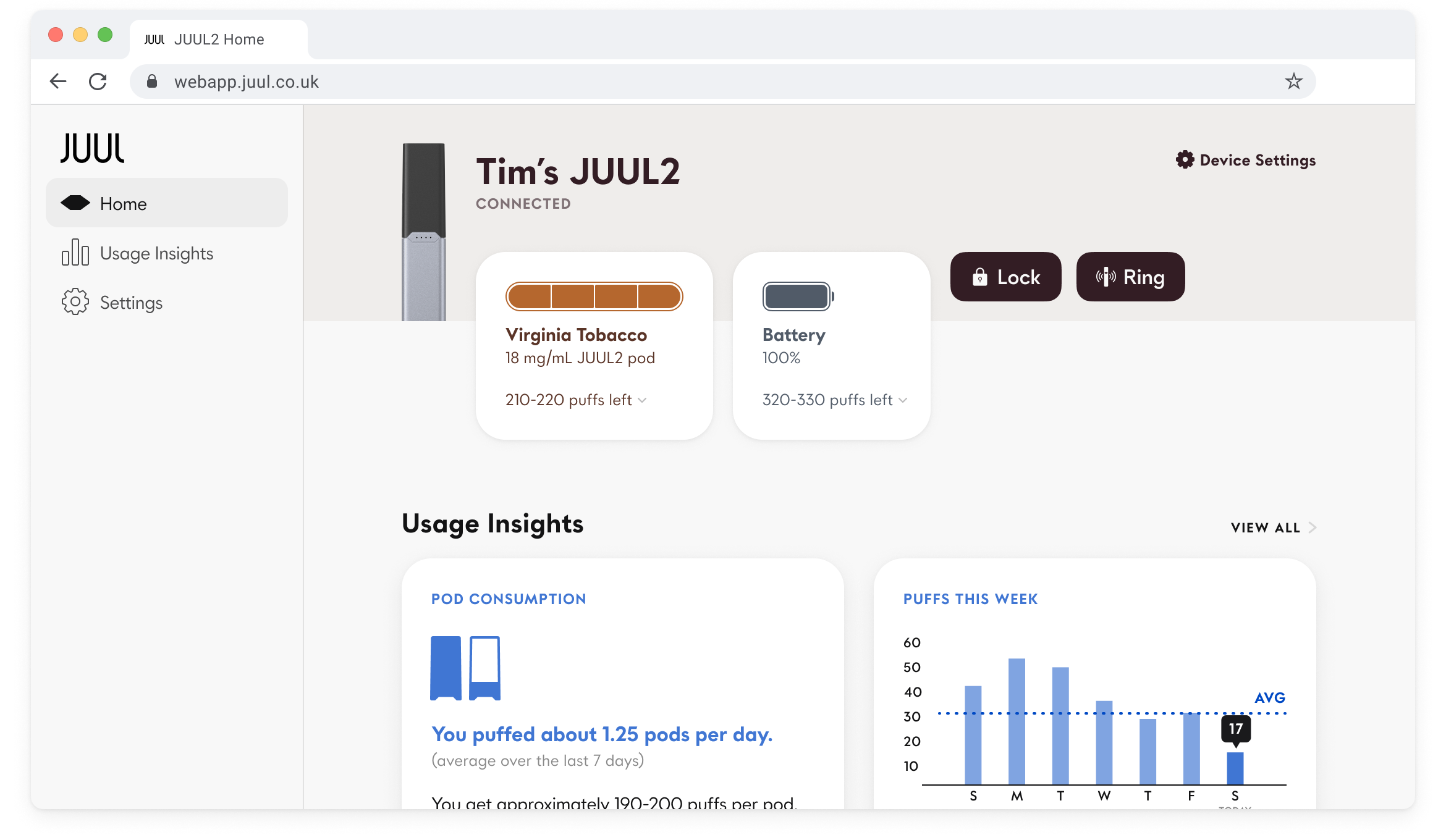
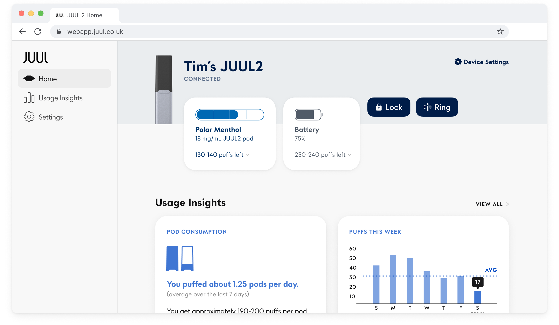
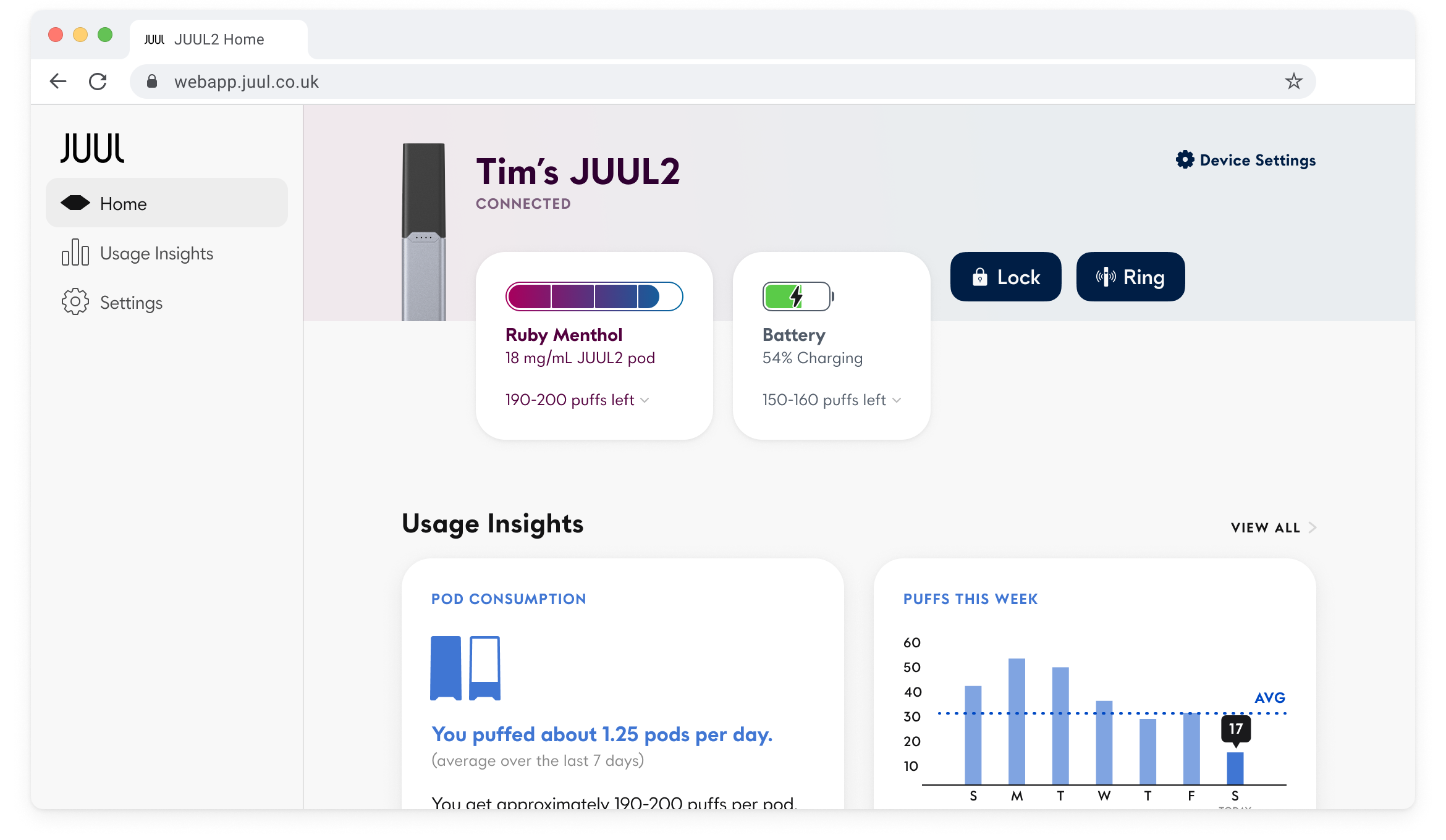
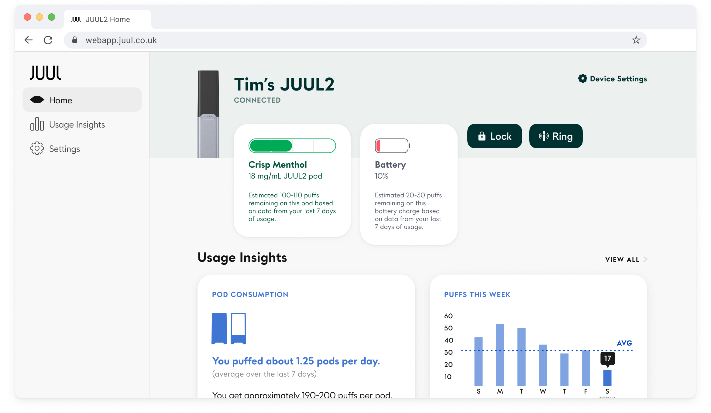
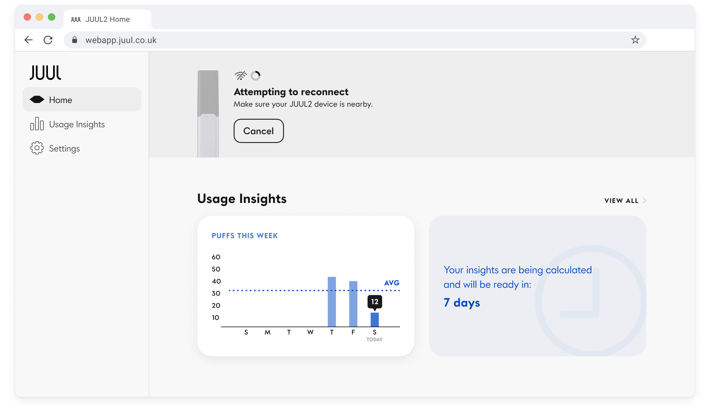
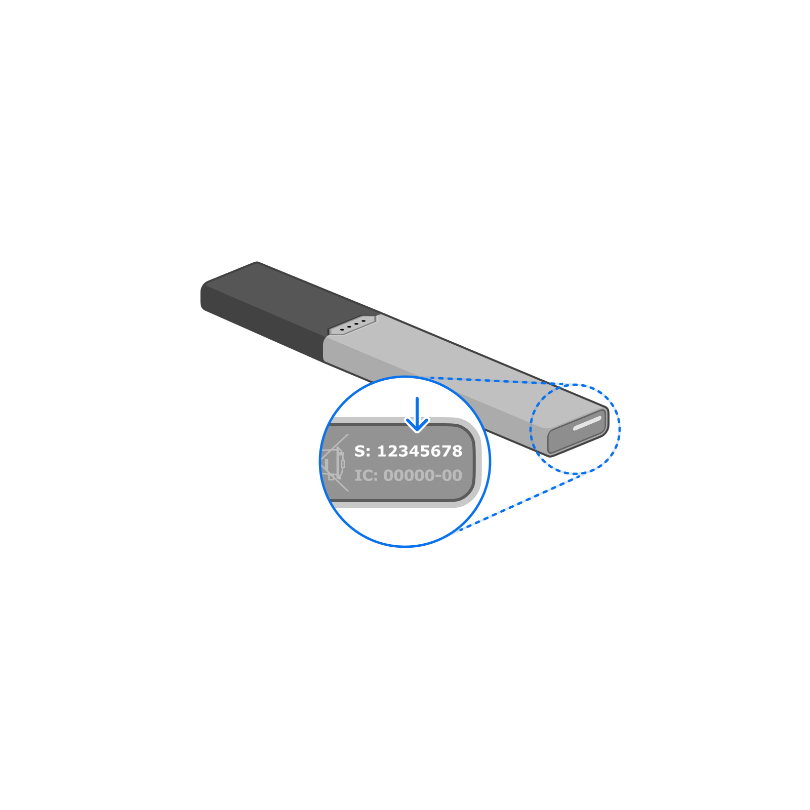
Despite being browser-based, the web app was able to give live updates on the status of the user's device via Bluetooth. The color pallete of various UI elements would change slightly depending on the flavor of the inserted pod. The JUUL2 could wasn't able to measure exactly how much e-liquid remained in the pod but we used advanced algorithms to give users an estimate of how many puffs they had left before needing to replace it.
Because there was no way for the device to know how much e-liquid was left in the pod we weren't able to give users an exact percentage to help them gague how long they had before it was time to switch to a new pod. We could only provide a rough estimate of how many more puffs they could take.
I experimented with ways we could visually represent this rough e-liquid estimate, including dividing up the determinate progress bar into quarters and have the end of the fill bar constantly animate with a wave effect so that an exact level of e-liquid could not be read.


Mobile App: Store Finder
The old retail store finder was showing its age; there were signs that various features had been removed while others had been tacked on at a later date so we made the call to start from scratch. I refreshed the main components with the latest version of our style guide, introduced search filters, simplified interactions between the map and list view, and implemented changes made to core UI components from the latest iteration of Material Design. I also prioritized the organization and structure of our internal Figma docs with a clear outline of all possible user flows to smooth out the handoff process to engineers and any future designers.


Live Notifications
We introduced live notifications to allow users to keep track of their JUUL2 device from their phone without opening the app. Users would be alerted if their device's battery is low, if it's time to replace their e-liquid pod, or if they left the house without it. We could even automatically disable the JUUL2 from producing vapor if connection to the phone was lost to prevent unauthorized usage.
When connected, the main notification featured a dynamic app icon that clearly depicted battery and e-liquid levels in real-time. The icon would change and feature a unique icon for each possible alert type.


Permission Requests
Obtaining mobile OS permissions can be challenging, particularly when your app relies on Bluetooth and location services. We discovered that a significant portion of users often denies all permission requests due to a lack of trust in non-stock apps. To address this, we implemented a step-by-step tour approach, guiding users through Android's intricate permission prompts.
All Projects

Welkin HealthWeb & Mobile Product Design

Circa NewsWeb & Mobile Product Design

NgmocoMobile UI & Graphic Design

BeboWeb UI Design

GayCitiesiOS Product Design

RidePalWeb & Mobile UI Design

BrandingGraphic Design


Life JournalingFilm

Welkin Health: EventsEvent Photography

Welkin Health: HeadshotsPortrait Photography

Jefferson MosqueraPhotography

Peace Out SkincareVideo Advertising

Gillian & JasonWedding Film


Tim Shundo © 2023
Created with Semplice